
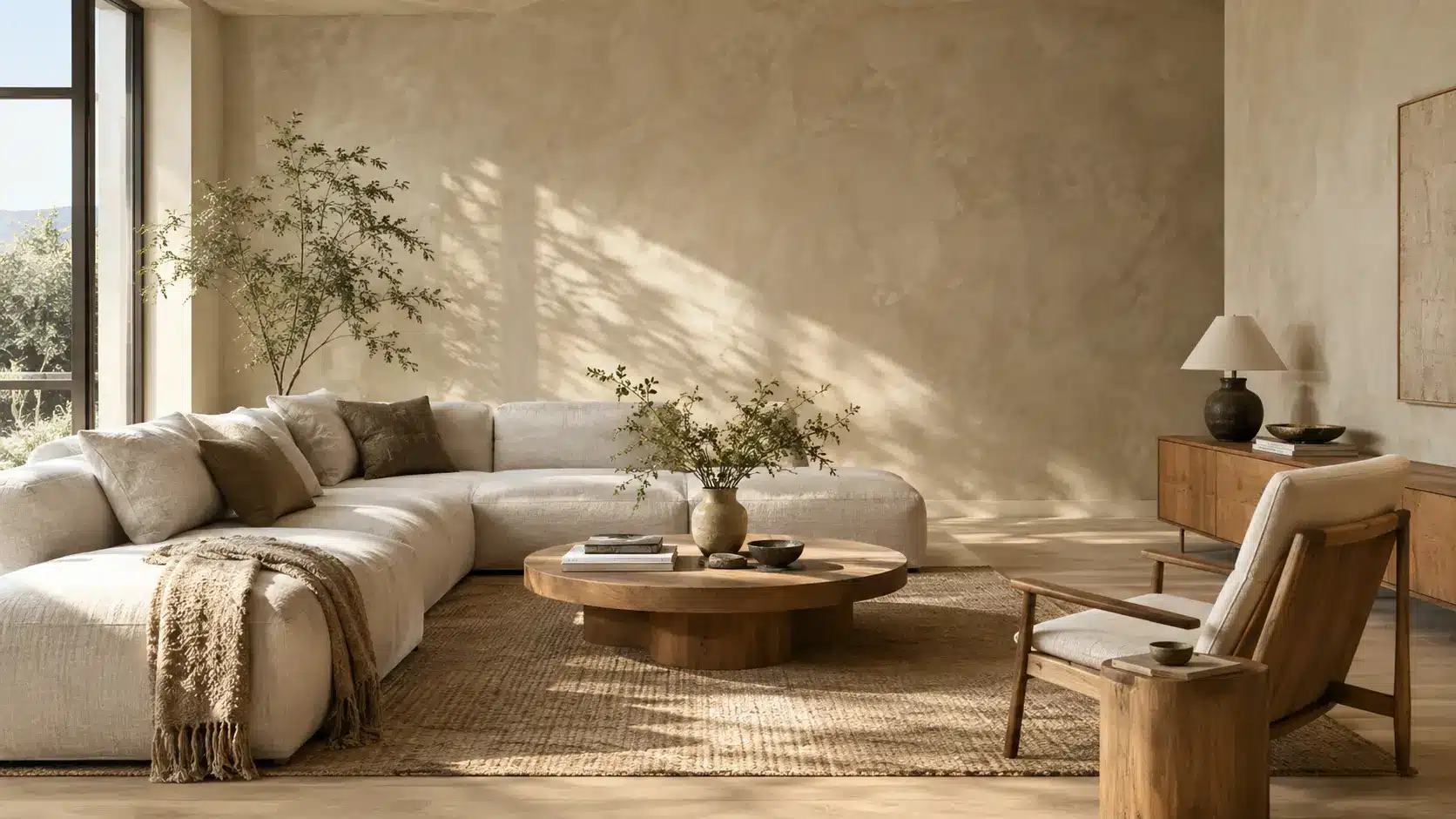

Because limewash cures into a mineral rich calcium carbonate surface, ambient light is diffusely reflected and scattered across the wall rather than producing the uniform glare of a synthetic paint film. This structural difference creates a soft, shifting depth that transforms as natural daylight changes throughout the day.
Understanding Limewash Colors: How Minerals & Light Scattering Work
Natural mineral pigments bind directly within the slaked lime matrix rather than floating inside synthetic acrylic binders. This micro porous surface scatters incoming light at varying angles across the wall.
Instead of a flat, solid block of color, you get subtle tonal variations across the surface commonly known as mottling. The mineral structure absorbs harsh glare, making deep tones feel velvety and pale tones feel soft rather than stark white.
Popular Limewash Color Palettes by Mood
Warm Organic Neutral
Soft, understated neutral shades designed for minimal spaces and open floor plans. These quiet tones balance natural daylight without harsh yellow or cold grey casts.
 Bone
 Oat
 Chalk
 Greige
 Linen
Earth & Clay
Rich mineral pigments including Terracotta, Sienna, and Ochre inspired by Mediterranean and Desert Modern architecture. Ideal for dining areas, entryways, or dramatic accent walls with organic warmth.
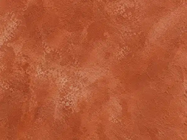 Terracotta
 Sienna
 Ochre
 Clay
Quiet Greens & Coastal Blues
Restful, nature-inspired mineral shades tailored for bedrooms, quiet studies, and relaxing interiors. Pairs seamlessly with natural oak timber and slubby linen textiles.
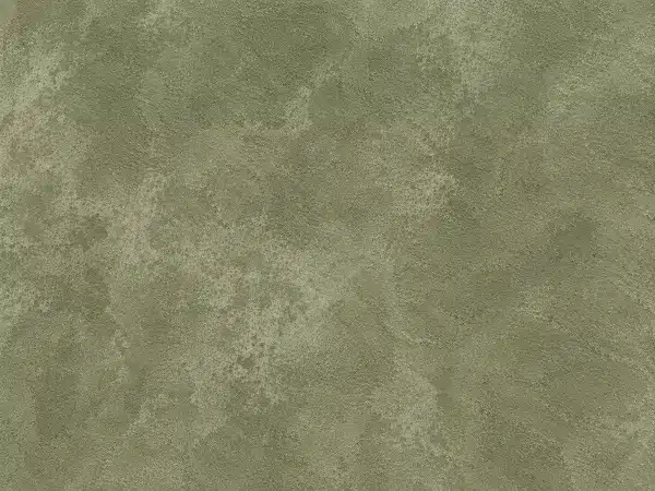 Sage
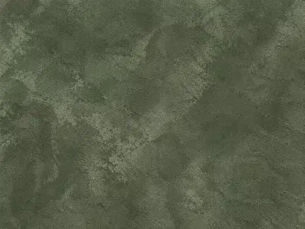 Eucalyptus
 Denim
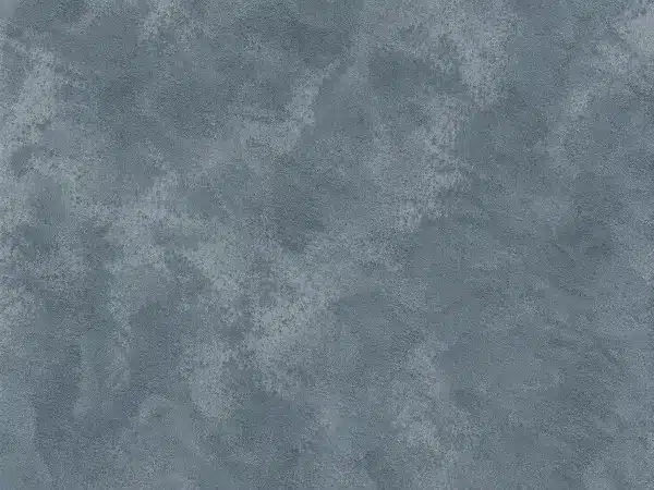 Slate
Moody Earth & Charcoal
Deep mineral tones that absorb direct glare while retaining subtle brushstroke highlights across the surface. Excellent for moody powder rooms, cozy dens, and high-contrast accent areas.
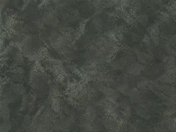 Soapstone
 Olive
 Iron
 Soft Black
Color Name
Palette Name
How Dry Down and Carbonation Shift Tone Depth
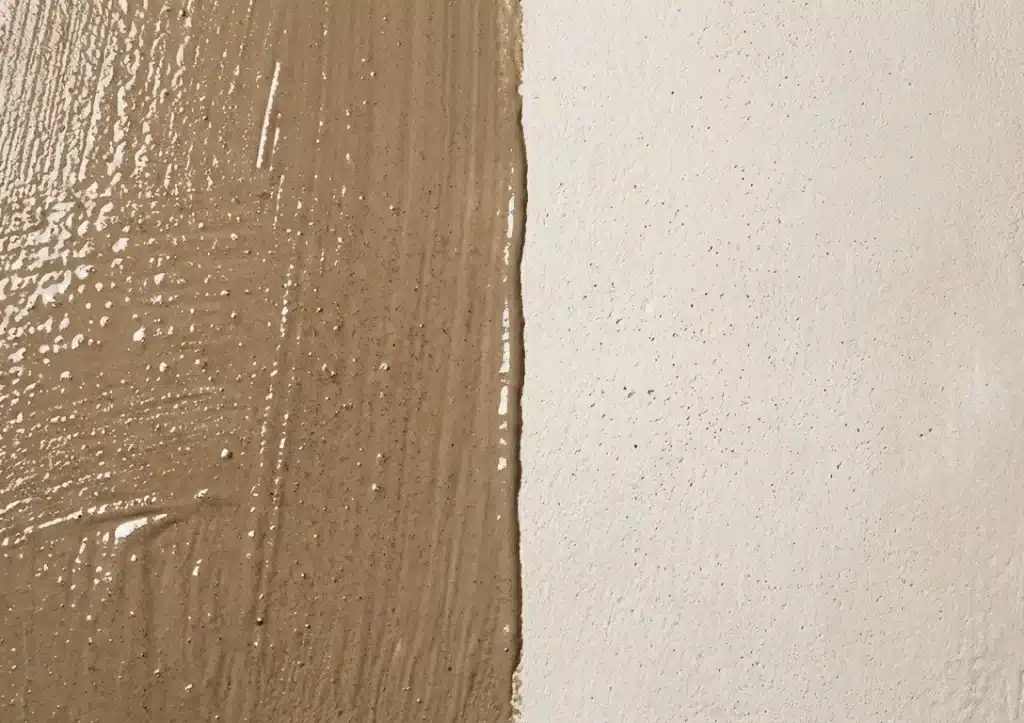
Limewash often appears darker and more saturated when wet, then dries to a lighter, softer looking finish as moisture evaporates.
As the limewash dries, calcium hydroxide reacts gradually with carbon dioxide in the air to form calcium carbonate. The resulting tone shift can be significant; a shade that looks like deep taupe in the bucket dries down to a soft almond on the wall. Always wait until the surface turns completely matte and dry before evaluating the final hue or coat placement.
Choosing the Right Limewash Tone for Each Room
Room exposure provides a reliable baseline for color selection, though real world factors like window size, local latitude, and exterior reflections (such as brick walls or dense foliage outside) will alter how light behaves in your specific space.
- North Facing Rooms: Cool, grey daylight can flatten muted shades. Warm undertones like bone, cream, or soft terracotta often help balance cold northern exposure.
- South Facing Rooms: Direct, intense sunlight can wash out pale tones. Muted greens, warm greiges, or cool slates tend to hold their visual weight better under bright sun.
- Living Rooms & Open Spaces: Mid tone neutrals showcase natural mottling best as sunlight moves across large wall surfaces throughout the day.
- Bathrooms: For bathrooms, use limewash on protected areas away from direct water exposure and follow the finish manufacturer’s recommendations for sealing and maintenance.
How to Correctly Test and Sample Limewash Palette Colors

Skip small paper swatches; limewash texture heavily influences how light and color interact. Prime a 2×2 foot sample board with a compatible mineral primer, then apply two thin coats of limewash using overlapping crosshatch strokes.
Observe the sample board directly in your space over a full day. Look at it under direct morning sun, late afternoon shade, and 2700K warm interior LED lighting to catch subtle shifts in undertone.
Pairing Limewash Palettes with Natural Materials & Furniture

Limewash pairs naturally with unrefined, tactile materials rather than high gloss synthetic surfaces.
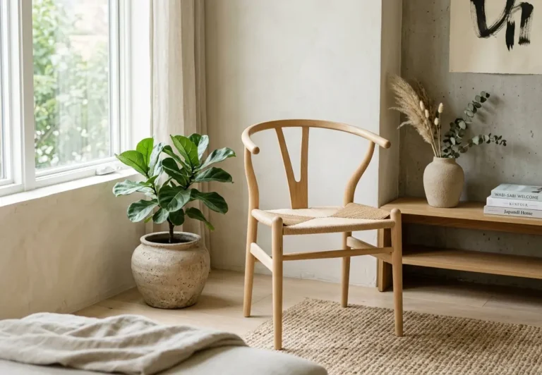
- Wood Finishes: Warm mineral plaster tones pair seamlessly with raw oak, walnut, or weathered timber.
- Metals: Unlacquered brass, brushed nickel, and oil rubbed bronze provide clean contrast against matte mineral textures.
- Textiles & Stone: Layer slubby linen, natural wool, travertine, and soapstone to complete an organic, textured interior.



1 thought on “Limewash Color Palettes: How to Choose Mineral Tones for Every Space”
Comments are closed.