
There’s a particular kind of confidence that comes from working in one color. Anyone can make a bouquet look interesting by throwing five different hues together — the contrast does most of the work for you. But hand a florist nothing but pink, and you find out fairly quickly whether they actually understand form, light, and space, or whether they’ve just been leaning on color the whole time.
That’s really what a monochromatic floral arrangement is testing. Without competing hues to catch the eye, every other decision becomes visible: how the stems are cut, how the petals catch or absorb light, how much air sits between one bloom and the next. It’s less forgiving than a mixed palette, but it rewards attention in a way that colorful arrangements often don’t. The eye isn’t jumping around looking for the boldest flower — it settles, and starts noticing texture and structure instead.
Clearing Up a Common Confusion
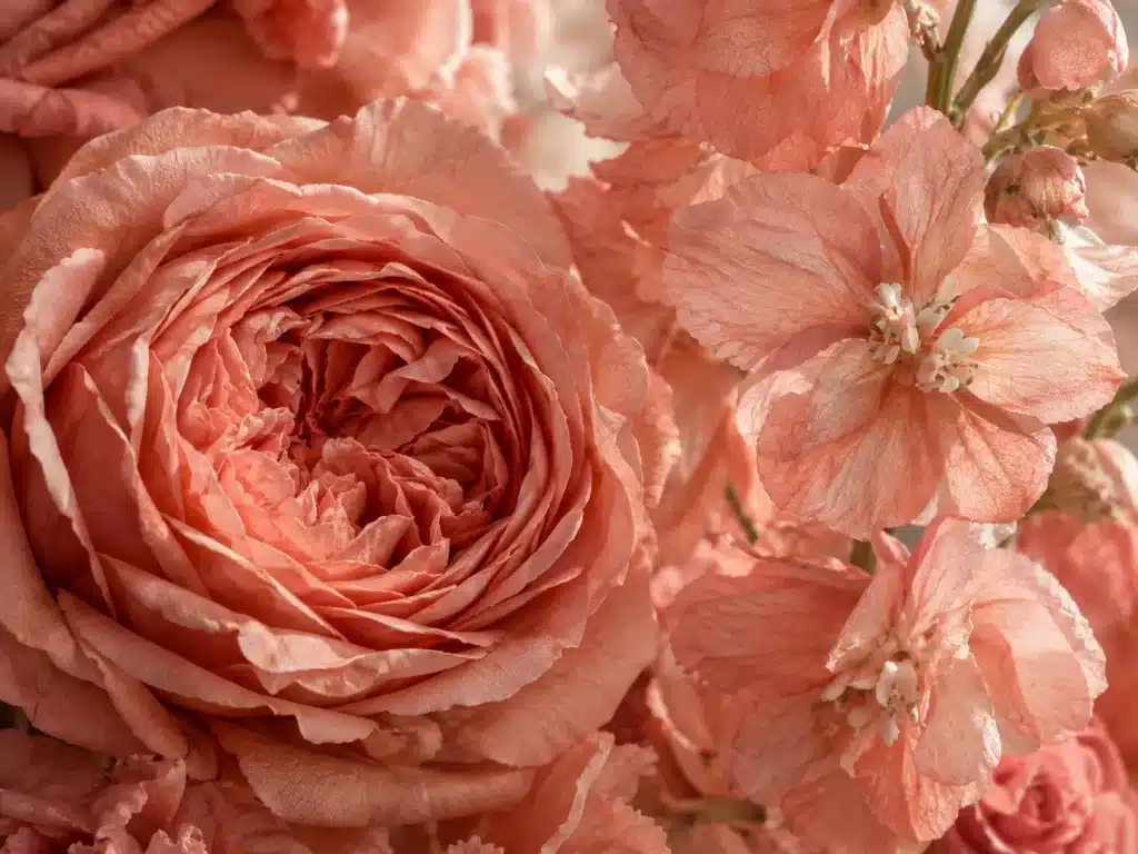
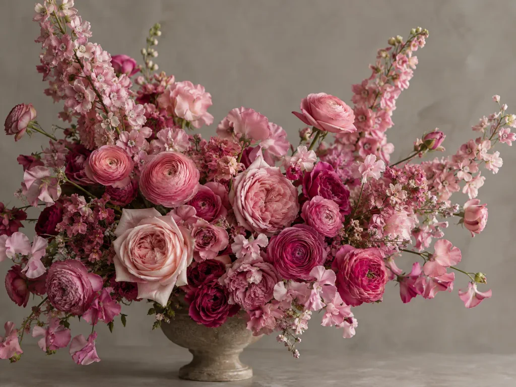
People often use “monochromatic” and “single-variety” interchangeably, but they’re solving different problems. A single-variety arrangement — say, a vase packed with nothing but white tulips — is a decision about what kind of flower to use. A monochromatic floral arrangement, by contrast, is a decision about what color to use, and it almost always benefits from mixing varieties. Pink roses next to pink ranunculus next to pink delphinium isn’t a contradiction; it’s actually the point. Different flowers hold color differently — a rose petal reflects light in dense, velvety pools, while a delphinium petal is thin enough to look almost translucent — and that variation is what keeps a single hue from reading as flat or lifeless. The two ideas can overlap, of course; you can have a monochromatic bouquet made entirely of one flower. But treating them as the same concept is what leads people to overload on identical stems and end up with something that looks more like inventory than design.
There’s also a question of how strictly to hold the color line. Some designers keep things tight — a narrow band running from blush to rose to a deep raspberry, nothing straying outside that family. Others, particularly with white designs, lean less on hue and more on warmth, coolness, and sheen, since pure white has almost no room to vary in saturation at all. And because cut flowers are grown things, not paint chips, most working florists accept a bit of drift — a stem that’s slightly cooler or warmer than its neighbors — as long as the overall impression still reads as one color family from a few feet away.
Building the Palette Before You Touch a Stem
It helps to think this through before you’re standing at a flower market with buckets on every side. Start by picking your anchor color, then decide on three points along its value scale: something light and airy near the top of the range, a workhorse mid-tone that can bridge almost anything, and one deep, saturated shade to anchor the design and give the eye somewhere to land. From there, think about texture — you want at least one smooth or glossy element and one soft or velvety one, because texture is doing a lot of the visual heavy lifting that color usually handles in a mixed bouquet. Finally, choose one flower with real structural presence, something with a strong enough silhouette — a tulip, a calla, a stem of delphinium — to define the outer shape rather than just filling space inside it.
Where Depth Actually Comes From

The single biggest failure mode in a monochromatic floral arrangement is flatness — a design that reads as a dense, uniform ball of one color with nowhere for the eye to rest or travel. Depth comes from two places working together, and both get skipped more often than they should.
The first is value variation, used deliberately rather than randomly. Lighter blooms tend to sit better toward the outer edges and upper portion of an arrangement, where they open the design up and keep it from feeling heavy. Mid-tones do the quiet work of transition, softening the jump between light and dark so nothing feels abrupt. The darkest, most saturated blooms belong near the visual center, slightly below eye level in most arrangements, where they can anchor the composition without dragging the whole thing down. It’s worth noting that very deep tones — a true burgundy, for instance — sit right on the boundary between red and purple, so they read differently depending on what’s around them. Used sparingly as an accent in a pink palette, burgundy adds gravity; used too heavily, it starts to fight the rest of the palette instead of grounding it.
The second is texture, and this is where a lot of the real craft lives. Glossy petals — calla lily, anthurium, tulip — catch and throw light, which makes them useful for focal points precisely because the eye is drawn to reflection. Velvety textures, like garden roses or cockscomb, do the opposite: they absorb light and read as weight and richness, which is why they tend to sit well in the lower, denser part of an arrangement. Airy, feathery, or linear textures — astilbe, delphinium, the loose cupped shape of ranunculus — are what keep the whole thing from feeling dense. They create small pockets of negative space between the heavier blooms, and that negative space is doing more work than it gets credit for. A design with no visual breathing room reads as crowded even if every individual flower is beautiful.
Stem length matters just as much as any of this. If every flower sits at the same height, the arrangement collapses into a flat plane no matter how carefully the colors and textures were chosen. Varying stem length — placing some blooms higher, tucking others deeper into the design so they sit slightly behind and below the front layer — creates the kind of dimensional layering that a photograph from directly above would show as genuinely uneven, even though from the front it still reads as cohesive. This in-and-out placement is probably the single most underused technique among people newer to floral design, because it’s invisible when it’s done well and glaringly obvious when it’s skipped.
A Practical Starting Structure
For anyone newer to building a monochromatic floral arrangement, a simple proportional framework helps avoid both overspending and under-designing: one or two line flowers to establish height and outer shape, one or two focal blooms to serve as the visual anchor, a larger quantity of affordable mass flowers to fill out the body, and a single filler or textural element to soften the gaps and add that crucial negative space. It’s a starting point rather than a formula — container size, what’s actually available at the market that week, and the shape you’re going for should all be allowed to push those proportions around.
Assembly, Roughly in Order
Get the mechanics sorted first — chicken wire, floral foam, or a kenzan, whatever suits the flowers and the container — and make sure the water and conditioning are handled before a single stem goes in. Establish the outer framework using your lightest line flowers, since it’s much easier to fill in a shape than to correct one that’s already too dense. Place the darkest or most visually striking blooms near the center, slightly below the midpoint of the design, to set the focal point early rather than trying to force one in at the end. Build outward from there using varied stem depths rather than a single front-facing plane, and finish by tucking filler into whatever gaps remain — checking, at each stage, whether the arrangement still has room to breathe or has started to feel dense again.
Three Palettes Worth Trying

A white-and-cream monochromatic floral arrangement is the most forgiving in some ways and the least forgiving in others — forgiving because it suits almost any setting, unforgiving because there’s so little color variation to hide behind, which makes textural contrast non-negotiable rather than optional. A blush-to-rose palette is probably the easiest entry point for anyone building their first single-color design, since the tonal range is wide enough to create real depth without straying from a clearly unified color story. A deep burgundy palette is the most dramatic option and the hardest to get right — dark tones carry real visual weight, and without something glossy or something airy to break it up, the whole arrangement can start to read as a single dark mass rather than a composed design.
Vessel and Greenery
The container is doing more compositional work than it usually gets credit for. A vase in the same color family as the flowers extends the monochromatic effect and makes the whole thing feel immersive; a neutral vessel — clear glass, crisp white, matte black — steps back and lets the flowers carry the visual weight entirely on their own. Greenery deserves similar restraint. Bright, saturated green foliage can undercut an otherwise careful single-hue design simply by being the most saturated thing in the room, which is why muted, low-chroma greens — sage, eucalyptus, dusty miller — tend to work better as quiet support rather than competing for attention.
What Usually Goes Wrong
Flatness is almost always a stem-length problem before it’s a color problem — pulling a few key blooms higher, or tucking a few deeper, solves it faster than adding more flowers ever will. A single bloom that feels out of place is usually a warm-versus-cool mismatch rather than an outright wrong color; the fix is often just moving it deeper into the arrangement so it reads as a transition rather than a focal point. A palette that feels muddy overall is frequently a case of mixed undertones — cool pinks sitting next to warm peaches — and unifying the temperature, not the hue, tends to fix it. And lighting changes everything: warm venue lighting flatters warm palettes but can dull cool pinks and purples, while cool white lighting sharpens whites and cool tones but can make warm palettes look slightly washed out. It’s worth walking any monochromatic floral arrangement under the actual lighting it’ll be seen in before calling it finished.
One Color Versus Neighboring Colors
It’s worth distinguishing this from analogous design, which is a different technique that gets confused with monochromatic work fairly often. Analogous palettes combine two or three colors that sit next to each other on the color wheel — yellow, yellow-orange, and orange, for instance — which gives more color variety while still keeping things harmonious. A true monochromatic floral arrangement stays inside a single hue instead and finds its variation entirely through value, saturation, and texture. The analogous approach tends to feel richer and more varied; the monochromatic approach tends to feel more restrained and more deliberately composed — and that restraint, more than anything else, is what makes it worth learning in the first place.