
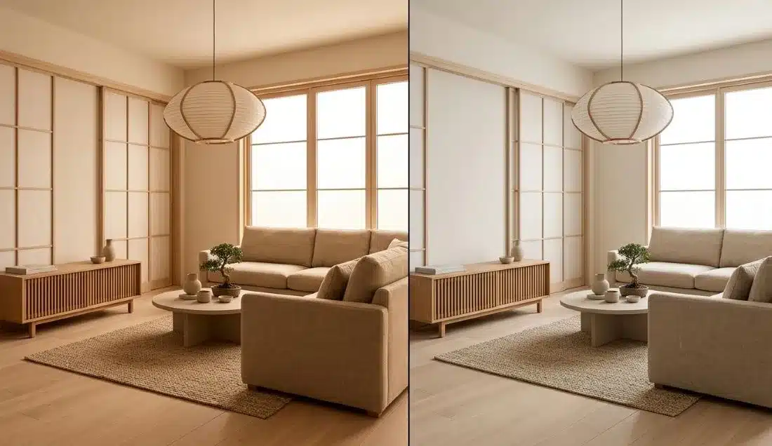
Lighting completely changes how natural materials look in a home. You can carefully pick solid white oak floors, a low-profile linen sofa, and handmade Washi paper shades, but using bulbs with an ill-fitting light spectrum can make organic textures feel flat or give warm wood an artificial tint.
Setting up the right Japandi lighting comes down to finding a balance between color temperature (CCT), spectral quality, fixture choices, and layering. This guide walks through choosing between 2700K vs 3000K, selecting the best paper pendants and floor lamps, and layering light sources across your space.
How Light Interacts with Natural Materials
Light temperature is measured on the Kelvin (K) scale, showing whether a bulb puts out warm or cool light:
- 1,800K–2,200K: Warm candle flame / deep amber glow
- 2,700K–3,000K: Soft warm white to neutral warm white
- 3,500K–4,000K: Cool neutral white
- 5,000K+: Bright daylight / cool blue tone
Japandi interiors rely on raw, unpolished textures—like pale ash, white oak, Washi paper, slub linen, and unglazed ceramics. The appearance of these natural materials is strongly influenced by the light source’s spectrum, the materials’ reflectance properties, and the surrounding lighting conditions.
According to research from the U.S. Department of Energy (DOE) on Color and Spectrum, two bulbs with the exact same 2700K rating can render colors differently depending on their underlying spectral power distribution. Higher CCT light sources (such as 4000K) contain a higher proportion of short-wavelength energy. When cast onto pale wood, these cooler light sources can make natural timber appear comparatively cooler or muted relative to warm ambient settings.
Warmer light sources carry more relative energy in yellow and red wavelengths, complementing the natural undertones in light woods and earth-toned fabrics.
2700K vs 3000K for Japandi Lighting: Which Should You Choose?
Choosing between 2700K and 3000K is one of the most common decisions when setting up Japandi style light fixtures. While both fall under warm white, they create subtly different room atmospheres.
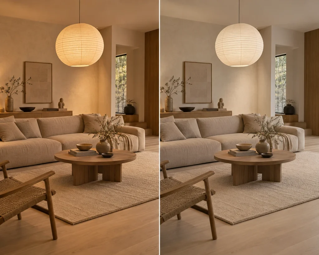
2700K: The Baseline for Living Rooms & Bedrooms
For lounge zones and bedrooms, 2700K is usually the safest starting point.
- Material Rendering: 2700K accentuates warm yellow and soft red tones in light woods like white oak, ash, and light teak.
- Light Quality: When used behind a Japandi paper pendant light or a linen drum shade table lamp, 2700K casts a gentle, comfortable glow across textured plaster walls.
- Atmosphere: The softer warmth helps you wind down in the evening, making living rooms and bedrooms feel calm and inviting.
3000K: Clean Warmth for Workspaces & Kitchens
3000K offers a slightly cleaner, neutral warm white tone.
- Material Rendering: On lighter or bleached woods, 3000K keeps things looking clean and modern without leaning too heavily into warm yellow tones.
- Task Performance: While 3000K is often thought to improve focus, actual clarity depends more on brightness (lux), beam distribution, and glare control than CCT alone. What 3000K does offer is a fresher, energizing feel that suits functional areas.
- Primary Uses: Ideal for Japandi kitchen island task lighting, bathroom vanities, reading nooks, and home office desks.
Best Japandi Lighting Fixtures: Pendants, Floor Lamps & Wall Sconces
Color temperature is only one part of the equation—the physical fixture, shade material, and light spread shape how the room actually feels day to day. If you want to see specific fixture ideas and styling inspiration, check out our companion guide on Japandi Lamp Ideas to Warm Up Minimalist Spaces.

| Fixture Type | Common Materials | Best Room Application | Lighting Function |
| Paper Pendant Lights | Washi paper, bamboo frames, fabric cords | Dining tables, living room centers | Softens and spreads light, helping reduce direct glare; works as a quiet centerpiece. |
| Wood & Linen Floor Lamps | Solid oak bases, unbleached linen shades | Living room corners, bedside reading chairs | Adds warm fill light to quiet corners while bringing in fabric texture. |
| Ceramic Wall Sconces | Matte plaster, unglazed terracotta | Hallways, bed headboards, entryway accents | Washes soft light up and down walls, highlighting plaster and paint textures. |
| Concealed LED Strips | Low-profile channels, frosted covers | Under kitchen cabinets, behind slatted wood walls | Adds gentle accent glows along architectural features without visible LED dots. |
Real-World Examples: Matching Light to Your Space
Here are three common room setups to help you decide which lighting strategy works best:
Scenario 1: White Oak & Paper Shades (Living Room)
- Materials: White oak flooring, beige linen sofa, Washi paper pendant, light plaster walls.
- Choice: 2700K
- Why: 2700K preserves the natural warmth of light oak and softens the light passing through paper shades, keeping the room relaxed.
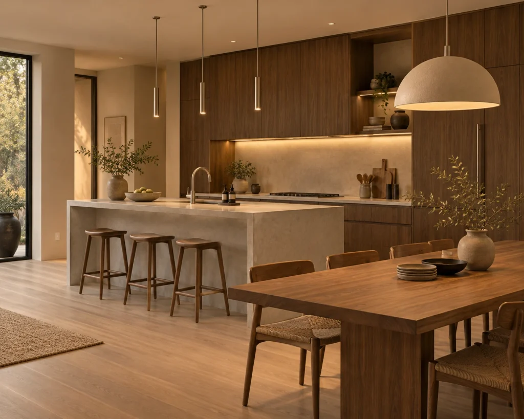
Scenario 2: Dark Walnut & Micro-Cement (Kitchen / Dining)
- Materials: Dark walnut cabinets, micro-cement island counter, brushed metal accents.
- Choice: 3000K
- Why: 3000K keeps gray cement surfaces looking clean while keeping dark walnut from feeling overly heavy or dim.
Scenario 3: Home Office & Reading Corner
- Materials: Ash wood desk, white walls, bamboo shades, task lamp.
- Choice: Tunable-White Lighting (2700K–3000K)
- Why: Tunable-white systems allow you to adjust CCT independently from brightness, providing crisp 3000K light during daytime work and shifting down to warm 2700K light for evening reading.
Color Quality Metrics: CRI, R9, and IES TM-30
When shopping for light bulbs for Japandi spaces, Kelvin ratings tell only part of the story. Color rendering metrics show how accurately a bulb reveals colors on natural finishes.
Color Rendering Index (CRI) and R9
CRI measures how accurately a light source reveals colors compared to a standard reference source at the same color temperature (0 to 100 scale). Standard bulbs often sit around CRI 80, which can leave natural wood and woven fabrics looking slightly dull.
Choosing bulbs rated CRI 90+ with a strong R9 score (which measures saturated reds) helps wood grain look rich and authentic. However, these target numbers are helpful guidelines rather than strict mandates—the right bulb ultimately depends on personal preference and room use.
Understanding IES TM-30
According to the Illuminating Engineering Society (IES) Position Statement on TM-30 (PS-11-18), light source color quality is best evaluated by looking at two complementary metrics together rather than relying on CRI alone:
- Fidelity Index (Rf): Evaluates how closely rendered colors match the reference source on a scale of 0 to 100.
- Gamut Index (Rg): Measures the average change in saturation. An Rg score near 100 indicates that the light source produces an overall color gamut area similar to the reference light, keeping wood and textile tones balanced without making them appear artificially oversaturated or dull.
How to Estimate Lighting Needs: Japandi Room Calculator
To get a general sense of how many lumens you need for your space, use our interactive estimation tool below.
Keep in mind that calculating light levels involves target foot-candles alongside ceiling height and wall finish adjustments.
Find your room’s light balance
Estimate a practical LED lumen budget, recommended color temperature, and a simple ambient–task–accent lighting mix. Adjust the room details to see your plan update instantly.
Room area: calculating…
No personal details required. This calculator runs entirely in your browser.
Illustrative range for whole-room fixtures, not a measured light level or lighting-design specification.
Use a diffused paper pendant for general glow and a focused reading lamp where needed.
Task lights need to illuminate the actual work surface; the room total alone cannot guarantee a safe or comfortable task-light level. Natural daylight is not subtracted, so this estimate also works as an evening starting point.
How is this estimate calculated?
Method: Room area (m²) × suggested general-lighting target (lux) ÷ (0.67 estimated utilization × 0.85 light-loss allowance), adjusted for ceiling height and overall surface reflectance. A soft/cozy or brighter setting modifies the target lux. These are editorial starting assumptions, not an ANSI/IES room-lighting prescription. The displayed range is ±20% around the modeled center; real uncertainty can be larger.
Base targets: living 130 lux, bedroom 100 lux, dining 150 lux, kitchen general 225 lux, home office general 200 lux. Targeted prep, detailed reading, and desk work may need additional dedicated task lighting (often about 300–500 lux at the task surface, depending on activity and user). Beam angle, shade absorption, fixture placement, age-related vision needs, reflectances, and local requirements may change the actual design.
Important: CCT (2700K vs 3000K) describes the visual color of light, not how bright it is. High-quality color rendering (for example, CRI 90+) is worth considering with natural oak and linen. Consult a qualified lighting professional for construction plans or safety-critical tasks.
Layering Your Light: Building Atmosphere
Relying on a single overhead light flattens a room and leaves harsh shadows. Building a comfortable atmosphere means placing light sources at different heights:
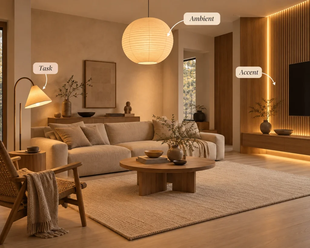
1. Ambient Light (General Glow)
- How to use: Large paper pendants, frosted drum lights, or indirect uplights to establish a soft baseline.
- Best choice: 2700K dimmable bulbs inside paper or fabric shades.
2. Task Light (Functional Zones)
- How to use: Adjustable desk lamps, kitchen under-cabinet strips, or reading lamps near armchairs.
- Best choice: 2700K–3000K bulbs with directional shades to prevent glare.
3. Accent Light (Depth & Shadow)
- How to use: Concealed LED channels behind media consoles, slatted wood screens, or inside open shelving.
- Best choice: 2200K–2700K low-output strips to cast soft, subtle shadows.
Room-by-Room Summary
| Zone / Application | Suggested Temperature | Color Rendering Focus | Recommended Fixture | Main Goal |
| Living Room (Main) | 2700K | High CRI / Balanced Rf | Japandi paper pendant light, floor lamps | Soft ambient warmth across wood and linen |
| Living Room (Accent) | 2200K–2500K | High R9 for wood grain | Hidden LED strips behind wood slats | Casts gentle linear shadows; adds room depth |
| Bedroom | 2500K–2700K | High Rf for soft textiles | Washi paper floor lamp for Japandi bedroom | Calming, low-glare light for night routines |
| Kitchen Prep Island | 3000K | High CRI / High Rf | Wooden linear pendants, ceramic drops | Clear light for cooking and food prep |
| Home Office / Desk | 3000K (or Tunable) | Balanced Rf / Rg | Directional task lamps | Clean focus; reduces glare while reading |
Dynamic Lighting: Dim-to-Warm vs. Tunable White
To keep your lighting aligned with daylight transitions, dynamic LED technologies offer flexibility beyond standard fixed bulbs:
- Dim-to-Warm (Warm Dim): As you lower the light output, the bulb automatically lowers its color temperature—dropping smoothly from 3000K down to a warm 1800K glow. This mimics traditional incandescent dimming and sunset warmth, making it ideal for relaxing evening spaces like dining areas and living rooms.
- Tunable White: Allows independent control over both brightness and color temperature (e.g., maintaining 100% brightness while shifting CCT from 2700K to 5000K). This suits multi-use workspaces where daylight productivity requires a crisper white, but evening tasks benefit from warm light.

Final Thoughts
Building a well-lit Japandi home is about balancing practical light needs with a calm, comfortable atmosphere. By matching 2700K for relaxing zones and 3000K for task spaces, picking tactile fixtures like Washi paper pendants, and layering ambient, task, and accent light, you can create a home that truly honors natural materials.


1 thought on “Japandi Lighting Guide: 2700K vs 3000K, CRI & Layering”
Comments are closed.