
You walk into a flower shop and your eyes go straight for color — the punch of coral dahlias, the calm of a sage-and-cream palette. That’s normal. Color is the flirt. But the thing that actually makes you stop and look twice, that makes an arrangement feel considered rather than assembled, is texture.
Texture is what separates a bunch of pretty stems from an arrangement that feels alive. It’s the reason a bouquet can look flat and stiff even when the colors are gorgeous — or why a monochrome, all-white centerpiece can still feel rich, dimensional, and worth a second look. Professional florists talk about texture constantly; home arrangers almost never do. Once you start seeing it, though, you can’t unsee it — and you start noticing exactly why some arrangements you admire feel so much more expensive than others, even when the flower selection itself isn’t unusual.
So, What Is Texture in Floral Design?
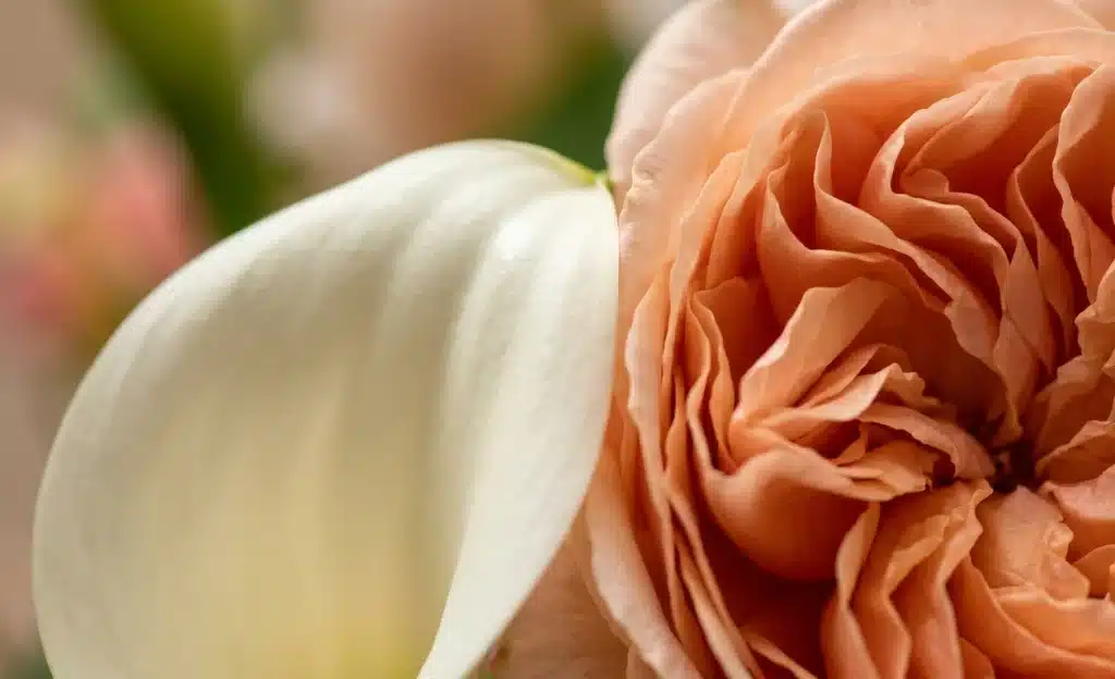
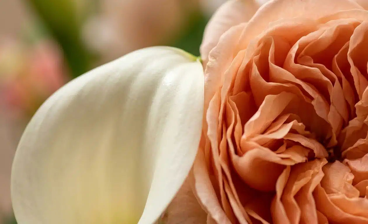
The simplest definition of texture in floral design: it’s the surface quality of a material — how it looks and how it feels — and, more specifically, how that surface interacts with light. That’s the working definition professional florists use, and it’s deceptively simple. No advanced theory required. But once you know to look for it, texture reveals itself as operating on two distinct levels simultaneously.
Tactile texture is what you feel when you touch it — the slick coolness of a calla lily, the plush nap of a garden rose, the papery rustle of dried grass, the waxy firmness of a succulent leaf. It’s the most intuitive kind of texture, because it maps directly onto physical sensation.
Visual texture is subtler and, arguably, more important to a finished arrangement. It’s what your eye reads from a distance, before you ever touch a thing: how light bounces cleanly off a glossy petal, versus how it gets absorbed and scattered into the folds of a ruffled bloom. Most of the time, we’re responding to visual texture without consciously realizing it — it’s doing a lot of quiet, unglamorous work in the background of every arrangement that “just looks right.”
Understanding this distinction is, in a real sense, the difference between arranging flowers and designing with them.
The Light Trick Every Good Florist Knows
Here’s the underlying principle, and it’s worth memorizing: shiny things come forward, soft things sink back.
A glossy, smooth surface — think calla lily, anthurium, tulip, or a waxy camellia leaf — reflects light directly back at the viewer. It reads as crisp, clean, and immediate. Your eye lands on it first, almost involuntarily, the way it’s drawn to any point of high contrast or sharp highlight.
A velvety, dense surface — garden rose, peony, ranunculus, celosia — behaves in the opposite way. Light scatters into all those tiny folds and crevices, creating soft micro-shadows rather than a single bright point. Instead of popping forward, that kind of material reads as weight. Depth. Richness. It’s the visual equivalent of a low, warm note in music, grounding everything built on top of it.
Put the two qualities side by side, deliberately, and you get real dimension without needing a single additional color. This is the entire trick behind those moody, all-blush or all-white arrangements that somehow never look flat despite having almost no color variation to lean on — professional designers are relying completely on this light-versus-shadow interplay to do the work that color contrast usually does. It’s a more sophisticated tool than color, frankly, because it works even in a restrained palette, which is exactly why advanced floral design with texture as its central strategy tends to look more editorial and less “craft store.”
Four Textures Worth Knowing

Professional florists don’t usually think in rigid, numbered categories — texture exists on a continuum, not in neat boxes — but having a mental shortcut is genuinely useful when you’re standing at a flower market trying to make quick decisions. Here’s a simple, practical way to sort what’s in front of you.
Smooth & glossy — calla lily, anthurium, tulip, camellia foliage. These are your showstoppers, your focal points. Their reflective surfaces mean they’ll win the eye every time, so use them sparingly and intentionally rather than scattering them throughout a piece, where they’ll compete with each other instead of anchoring the design.
Velvety & dense — garden rose, peony, carnation, celosia, ranunculus. These give a bouquet its plush, grounded feeling and its sense of visual mass. They’re best placed low and central, where their weight can anchor everything built up and around them, rather than near the top or edges, where that same density can start to feel top-heavy.
Airy & linear — astilbe, delphinium, ornamental grasses, baby’s breath, amaranthus. Wispy, semi-transparent, full of movement. These belong on the outer edges and in the gaps between denser material, where they soften the overall silhouette and let the design breathe rather than read as one solid mass.
Coarse & sculptural — sea holly, thistle, protea, scabiosa pods. The wild card of the four. A little goes a long way here, but one spiky, textured element placed beside something silky-smooth is often exactly what gives an arrangement personality instead of just prettiness. It introduces a small amount of visual friction, and friction, used well, is what keeps an arrangement from feeling generic.
These four categories aren’t a formula to be followed mechanically — they’re a diagnostic tool. When an arrangement feels flat or unfinished, running through this list is usually the fastest way to identify which category is missing.
Three Techniques to Steal for Your Next Arrangement
1. Stop cutting every stem to the same length. This is the single most common mistake home arrangers make, and it’s the reason a lot of otherwise well-chosen flowers still end up looking flat and amateurish. The fix is straightforward: tuck your denser, darker blooms slightly lower and inward, giving them a small recess so they cast a natural shadow within the arrangement itself. Then let your glossy or wispy stems reach up and outward past them, catching light freely rather than being blocked by material in front of them. That height differential alone — just an inch or two of intentional variation — is often enough to make an entire arrangement read as three-dimensional instead of two.
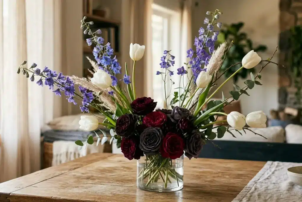
2. Let some space breathe. It’s tempting to cram every last stem in — more flowers can feel like more value, especially when you’re paying for them. But tightly packed arrangements blur into visual noise; you genuinely can’t appreciate any single bloom’s texture when it’s shoulder-to-shoulder with ten others competing for the same sliver of attention. Florists who teach negative space as a technique often start students with a hard numerical limit — as few as fifteen stems, in some workshop exercises — specifically to force the instinct to leave room. It feels counterintuitive at first, almost wasteful. Try it anyway. The restraint reads as intentional and confident, not sparse or unfinished.
3. Pick one hero texture, then support it — don’t compete with it. A common overcorrection, once you’ve learned to notice texture, is throwing in everything at once: spiky thistle, ruffled roses, slick callas, feathery grass, all crowded into the same small vase. It reads as chaos rather than richness, because there’s no clear hierarchy for the eye to follow. Instead, choose one dominant texture to build around, add one or two contrasting textures in a clearly supporting role, and stop there. Restraint, more than variety, is usually what separates a professional-looking arrangement from an amateur one.
Where Texture Meets Container
It’s easy to forget, but the vessel itself is part of the texture story, not just a neutral holder for the flowers.
- Clear glass is slick and visually light. Pair it with clean, sculptural stems like calla lilies or orchids, where the glossy container echoes the glossy flowers.
- Matte ceramic absorbs light and feels earthy and grounded. It’s a natural partner for wildflowers, dried stems, and velvety roses — materials that already lean soft and diffuse.
- Polished metal is mirror-bright and inherently formal. Let it hold smooth, structured blooms like anthuriums or gardenias, where the reflective surfaces reinforce each other.
- Terracotta or rough, unfinished wood brings its own organic texture into the mix. Pair it with grasses, thistles, and anything with a slightly wild, unstructured habit, so the container and the material feel like they belong to the same visual world.
Choosing a container without thinking about its surface quality is a missed opportunity — it’s one more layer of contrast (or harmony) available to you at essentially no extra cost.
Common Mistakes Worth Avoiding
Even once you understand the theory, a few practical missteps show up again and again:
- Overcrowding textures. Combining too many competing surfaces — spiky, ruffled, glossy, and feathery, all in one small design — creates visual confusion rather than visual interest. Limit yourself to one dominant texture and a small number of clearly supporting ones.
- Flattening the silhouette. Uniform textures cut to uniform heights is the single fastest way to kill any sense of depth. The staggered-height technique described above exists specifically to counteract this.
- Ignoring the venue’s lighting. A moody, texture-heavy arrangement full of dark, light-absorbing material can look genuinely muddy in a dimly lit room. In low-light settings, lean toward reflective foliage and lighter, glossier blooms that can actually catch and return the available light.
The Bottom Line
Color gets the first glance. Texture is what keeps someone looking, and it’s what makes the difference between an arrangement that photographs well and one that photographs and holds up in person, under changing light, over several days. Once you start building floral design with texture in mind — not just color, not just which flowers happen to be in season — everything you make will look more finished, more intentional, and more professional, even using the exact same flowers you’d have reached for anyway. Next time you’re building an arrangement, or just eyeing one in a shop window, try tracing where the light lands and where it quietly disappears into shadow. That’s texture doing its job, whether you were consciously aware of it or not.
Further reading: trade publication Florists’ Review on the principles and elements of floral design; Iowa State University Extension’s guide to the elements of design; Team Flower’s lessons on negative space; and Bloom College’s floristry curriculum on contrast and texture.


1 thought on “Texture in Floral Design: The Secret Ingredient Your Arrangements Are Missing”
Comments are closed.