
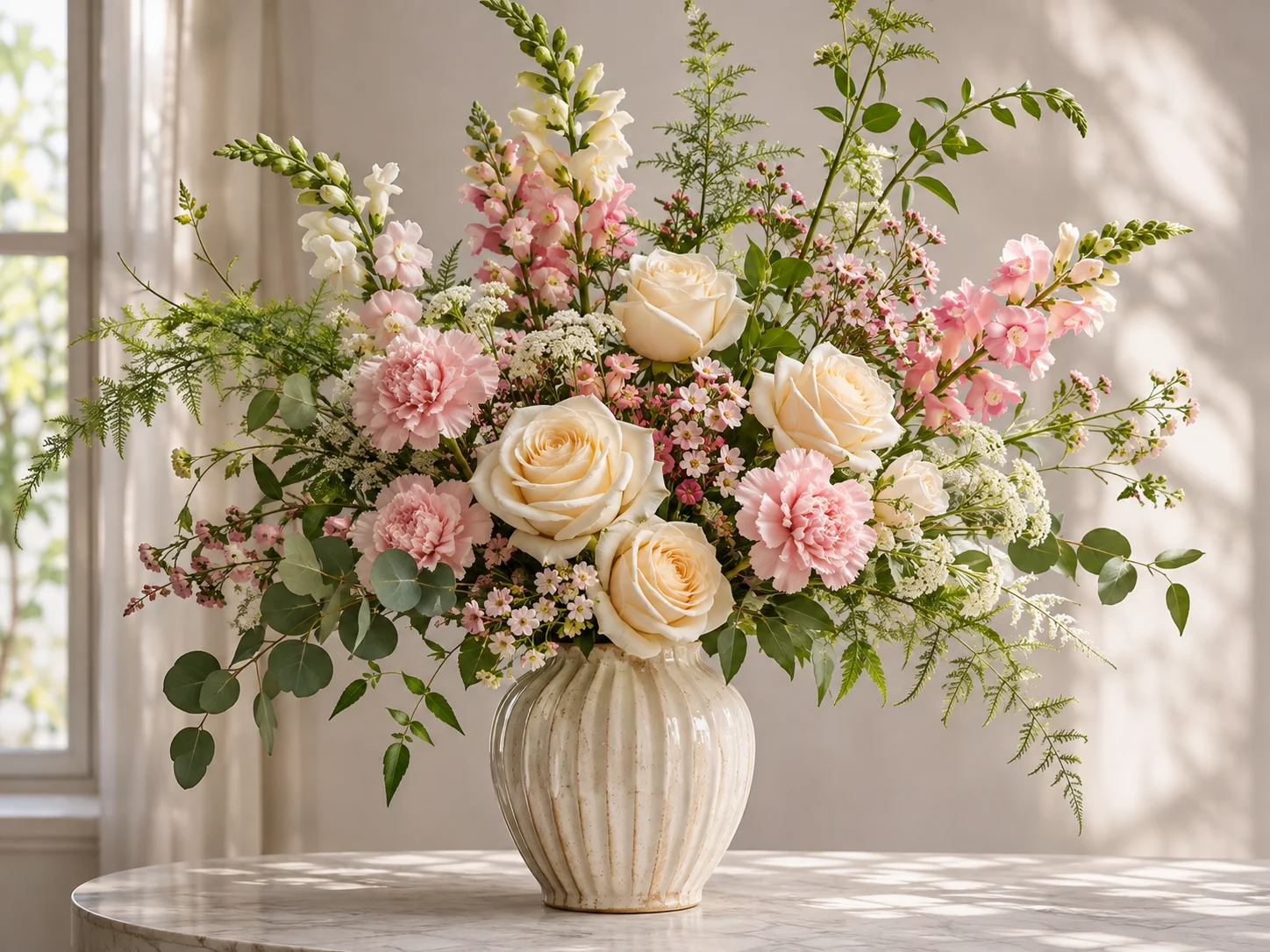
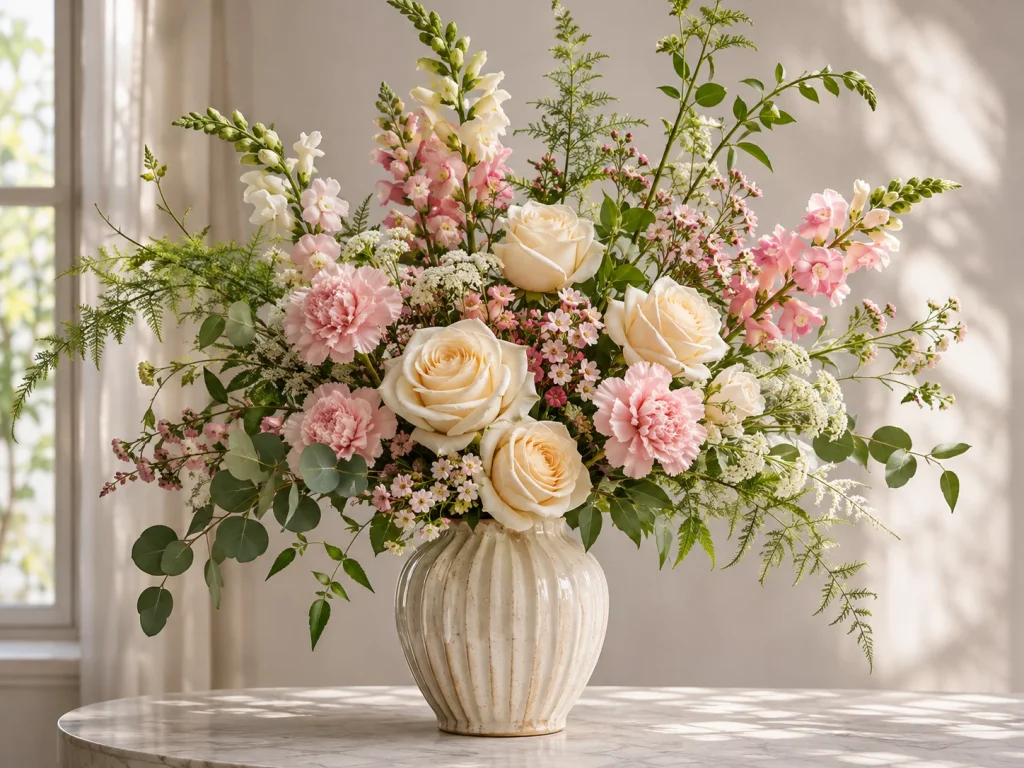
Beautiful flowers don’t always make a beautiful arrangement. Sometimes the colors clash, the stems look awkward, or the whole design feels crowded.
Understanding the elements of floral design helps you see what’s missing and how to fix it. These seven elements—line, form, color, texture, space, size, and pattern—give you a practical way to arrange flowers with more confidence.
What Are the 7 Elements of Floral Design?
The seven commonly taught elements of floral design are line, form, color, texture, space, size, and pattern. Each describes a different visual quality that influences how flowers work together.
| Element | What It Controls | Simple Example |
|---|---|---|
| Line | Direction and visual movement | A tall snapdragon draws the eye upward |
| Form | Three-dimensional shape | Rounded roses create fullness in a bouquet |
| Color | Mood and visual relationships | Peach and cream flowers create a soft palette |
| Texture | Surface appearance and contrast | Smooth tulips beside feathery foliage |
| Space | Filled and open areas | Visible gaps separate individual blooms |
| Size | Visual dimensions | Large dahlias paired with smaller flowers |
| Pattern | Repeated visual features | Pink flowers appearing throughout an arrangement |
Some professional organizations use eight-element frameworks. National Garden Clubs includes light, while the American Institute of Floral Designers (AIFD) includes fragrance. Both recognize the same seven core visual elements.
Light changes how we perceive colors and surfaces, while fragrance adds a sensory quality beyond appearance.
For everyday flower arranging, the seven elements provide a useful foundation. Once you understand them, you can make better decisions about which flowers to use, where to place them, and when to stop adding more.
The 7 Elements of Floral Design Explained
1. Line — Directing the Eye
Line is the visual path your eyes follow through an arrangement. It can come from a long stem, a curved branch, the direction of a flower head, or the outline created by several flowers.
Different lines give arrangements different personalities.
- Vertical lines emphasize height and create an upright, structured look.
- Horizontal lines extend the design outward and work well in low arrangements.
- Diagonal lines introduce energy and make the composition feel more dynamic.
- Curved lines soften the outline and create a sense of natural movement.
Think about three snapdragons in a narrow vase.
Place all three upright, and the design feels tall and orderly. Angle one stem outward, and the outline becomes more relaxed. Replace that stem with a naturally arching branch, and the arrangement takes on a flowing shape.
Even with a similar number of stems, changing their direction can give the entire arrangement a different character.
How to Use Line in Your Own Arrangement
Begin with one or two stems that establish the main direction before adding larger flowers.
For a tall arrangement, let the longest stem create the overall height. Position shorter stems so they reinforce that direction rather than compete with it.
For a loose garden-style bouquet, a few outward-reaching stems can break up a rigid outline.
Cutting every stem to the same length can remove the natural movement that makes an arrangement interesting.
Before trimming, hold each stem beside the vase and turn it slowly. Its natural curve may already suggest the best position.
2. Form — Creating Shape and Depth
Form describes the three-dimensional shape of individual materials and the arrangement as a whole.
A rose has a rounded form. A calla lily has a more sculptural, elongated form. A cluster of baby’s breath creates an airy, branching form.
These differences influence how flowers look together, even when their colors are similar.
The overall arrangement also has a form. You might choose a compact round shape, a triangular outline, a sweeping crescent, or a deliberately asymmetrical composition.
The important distinction is that form isn’t only the outer silhouette. It also includes depth.
Imagine arranging five roses in a vase.
If every flower head sits at the same height and distance from the viewer, the arrangement may look like a flat wall of blooms.
Now move one rose closer to the front, place two slightly farther back, and raise another above the others.
The outer shape can remain almost unchanged, but the arrangement gains depth.
For a rounded centerpiece, place a few larger flowers first and build a softly curved outline around them. Avoid forcing every bloom into the exact same plane.
For a modern asymmetrical arrangement, choose one prominent shape—perhaps a tall branch or large flower—and allow the remaining materials to support it.
A useful viewing test: Look at the arrangement from the side. If every flower head forms one flat surface, reposition a few stems at different depths.
The goal isn’t to make the arrangement uneven for its own sake. It’s to let individual flowers occupy the space naturally.
3. Color — Choosing Flowers That Look Good Together
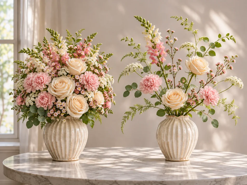
Color is often the first thing people notice about a floral arrangement.
It can make flowers feel warm and cheerful, cool and peaceful, or dramatic and bold. But more colors don’t necessarily make a better design.
A useful starting point is to choose a color relationship before arranging the flowers.
Monochromatic Arrangements
Use different shades of one color family.
For example, combine pale pink roses, medium pink carnations, and deeper pink ranunculus.
The changing shades provide variety without introducing unrelated colors.
Analogous Arrangements
Choose neighboring colors on the color wheel.
Yellow, orange, and red-orange make a warm combination. Blue-violet and purple can create a cooler atmosphere.
These combinations often feel connected because the colors share similar visual qualities.
Complementary Arrangements
Use colors from opposite areas of the color wheel, such as purple and yellow.
Complementary colors create strong contrast. You can make the arrangement easier to look at by choosing one dominant color and using the other as an accent.
What If You Have Several Different Flower Colors?
Suppose your flowers include pink, orange, yellow, red, and purple.
You don’t necessarily need to remove most of them. First, decide which color should stand out.
For example, let pink and peach flowers make up the main arrangement, then use a few deep burgundy blooms as accents.
Rather than grouping every burgundy flower on one side, distribute them across two or three positions.
The repeated color helps connect the arrangement.
Also consider the room where the flowers will be displayed. Deep-colored blooms can appear darker in weak lighting, while pale flowers may become more prominent against a dark background.
Before cutting the stems, lay your flowers beside one another. Try removing one color, then putting it back.
Sometimes the color you thought was essential is the one making the arrangement feel busy.
4. Texture — Adding Interest Without Adding More Colors
Texture refers to the appearance or feel of a flower’s or leaf’s surface.
A tulip has smooth petals, while a carnation has a ruffled appearance. Garden roses often have layered, delicate petals. Broad, glossy foliage looks very different from fine, feathery greenery.
Combining these textures can make a simple arrangement more engaging.
Consider an all-white arrangement containing:
- Smooth white tulips
- Ruffled white carnations
- Small clusters of baby’s breath
- Broad green leaves
The colors remain restrained, but the surfaces provide visual variety.
Texture can also change how dense an arrangement appears. A tightly clustered mass of small flowers may look heavier than a few open stems occupying the same space.
Try pairing one prominent texture with a contrasting one.
If your main flowers have large, heavily layered petals, add something smoother or more delicate around them. If the arrangement contains mostly slender stems, a few fuller flowers can give it more visual substance.
Be selective with filler flowers. Adding several different airy materials doesn’t always improve the result, especially when they hide the shapes of your main blooms.
Instead, hold one contrasting stem against the arrangement before adding it. Notice whether it makes the larger flowers easier to appreciate or simply adds visual noise.
A limited color palette with carefully chosen textures can look just as interesting as a multicolored bouquet.
Even a simple bouquet can look more dimensional when its textures work together. A closer look at texture in floral design shows how smooth, velvety, airy, and coarse materials interact with light—and how to combine them without overwhelming the arrangement.
5. Space — Making Room for Individual Flowers
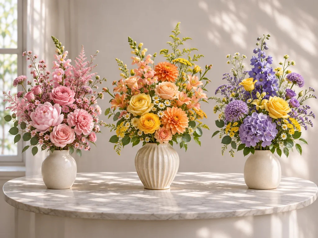
Space describes the filled and open areas within and around a floral arrangement.
Designers commonly distinguish between:
- Positive space: Areas occupied by flowers, stems, foliage, and other materials.
- Negative space: Open areas that remain visible between and around those materials.
Negative space isn’t wasted space. It helps define shapes, separate flowers, and create a sense of depth.
Imagine placing five roses close together in a vase. Their petals touch, and the individual blooms begin to merge into one rounded mass.
Move two roses slightly apart and raise another flower, leaving a visible opening between them.
Suddenly, you can appreciate the shape of each rose more clearly.
This doesn’t mean every arrangement needs large gaps.
A compact, rounded centerpiece may intentionally use very little negative space. A minimalist arrangement with only a few sculptural stems might depend on it.
The right amount depends on the design.
How to Tell Whether an Arrangement Is Too Crowded
Move a few feet away from the vase.
Can you easily distinguish the main flowers? Or do they blend into one continuous shape?
Look at the gaps between larger blooms. A visible opening can make a flower feel more prominent without requiring anything else to be added.
If the arrangement seems crowded, remove one supporting stem temporarily.
Does the design become clearer? If so, you may not need to replace it.
Also watch for the opposite problem. A large, accidental opening in the middle of an otherwise compact arrangement may make it look unfinished.
Rather than filling every gap, adjust the surrounding stems until the spaces fit the overall shape.
6. Size — Understanding the Relationship Between Flowers and the Vase
Size concerns the visual dimensions of individual flowers, foliage, and other design components.
A large dahlia surrounded by tiny waxflowers produces a different effect from a vase filled with equally large dahlias.
The first emphasizes contrast between sizes. The second creates a stronger, more uniform mass.
When planning an arrangement, it’s useful to think about three flower roles.
| Flower Role | Example | What It Adds |
|---|---|---|
| Large, prominent flowers | Dahlia or garden rose | Strong visual presence |
| Medium supporting flowers | Carnation or ranunculus | Connections between larger blooms |
| Small accent flowers | Waxflower or small spray blooms | Detail and softer transitions |
These roles are optional, not rules. A bouquet made entirely from one flower variety can still be beautiful.
Size also matters when matching the arrangement to its container.
A wide vase with a few tiny flower heads may look visually disconnected. A narrow, lightweight vase holding several heavy branches may become unstable.
Consider the flower heads, stem lengths, width of the arrangement, and stability of the container together.
A Practical Example With an 8-Inch Vase
Suppose you have an 8-inch-tall vase and want a loose upright arrangement.
You might begin with stems extending roughly 10–14 inches above the rim, then adjust based on their natural shape and weight.
This is only a starting example, not a required proportion.
A sturdy vase with tall, slender stems may support a more dramatic shape. Large, heavy flowers might need shorter stems or a wider container.
Where you display the flowers matters, too.
A dining table arrangement should usually allow people to see across the table comfortably. An entryway arrangement has more freedom to extend upward or outward, provided it remains stable.
The goal is to make the flowers and container look intentionally connected.
7. Pattern — Using Repetition Naturally
Pattern is created when visual features repeat in a recognizable way.
In floral design, those features might be colors, flower shapes, textures, or the directions of stems.
For example, imagine using six pink spray roses.
Gather all six in one corner, and they form a single pink cluster.
Distribute them throughout the arrangement, and the repeated pink blooms begin to connect different areas.
You can create pattern by repeating:
- The same flower at different heights
- A color in several parts of the arrangement
- Similar curved stems
- A combination of broad and narrow foliage
- Small flower clusters separated by larger blooms
Pattern doesn’t require perfect symmetry or equal distances.
In fact, a garden-style bouquet often feels more natural when the repetition is slightly irregular.
Try placing three similar flowers at different heights. Position one near the front, another deeper in the arrangement, and the third slightly higher.
Step back and follow them with your eyes.
You may notice that the repeated blooms create a visual path through the bouquet.
This leads to an important distinction: pattern is an element, while rhythm is a principle of design. Repeated forms or colors can help create rhythm by guiding the eye from one area to another.
How the Elements Work Together in a Floral Arrangement
Understanding each element separately is useful, but real arrangements rarely emphasize just one.
The following three examples use different combinations of the seven elements. They also illustrate why choosing the right arrangement depends on where it will be displayed.
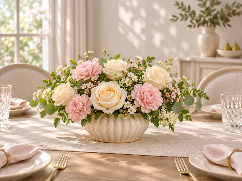
Example 1: A Simple Dining Table Arrangement
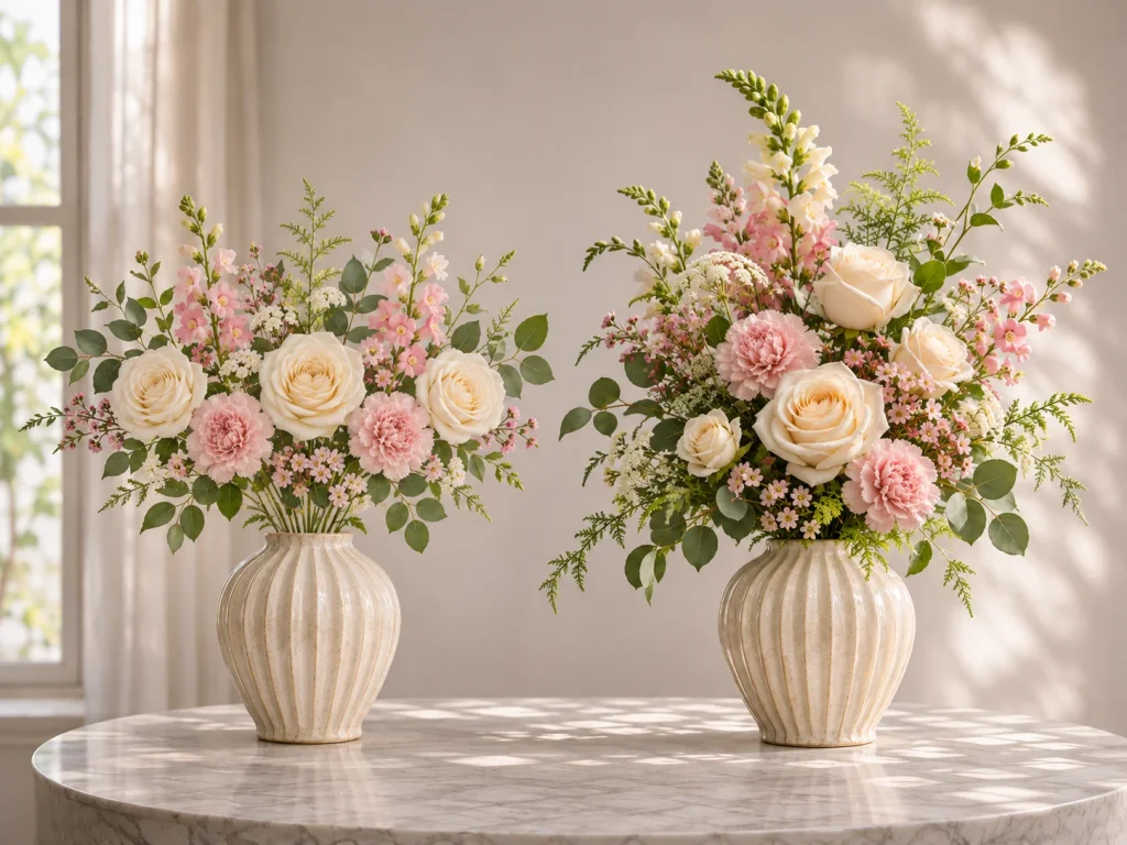
Design goal: A low, softly rounded centerpiece that looks attractive from multiple sides without obstructing conversation.
Suggested materials
- 3 cream roses
- 4 pale pink carnations
- Several small white accent flowers
- A few compact leafy stems
- A short, stable vase
Begin with the roses, placing them at slightly different heights and depths.
Add the carnations between the roses rather than arranging them in a separate cluster. This helps the rounded flower forms connect.
Use small accent flowers sparingly to soften the outline. Leave enough space for the larger blooms to remain visible.
From above, the flowers should appear distributed around the vase rather than gathered entirely toward one side.
The pale colors create a gentle palette, while the differences in flower size and texture prevent the arrangement from looking uniform.
Main elements: Form, color, size, and space.
Final check: Place the arrangement on the dining table and sit down. Can you see someone seated opposite you comfortably? Does the arrangement look finished from the other side?
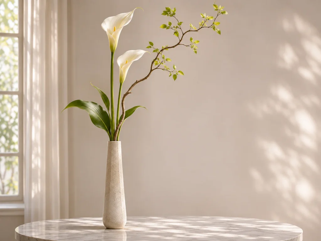
Example 2: A Tall, Modern Floral Arrangement
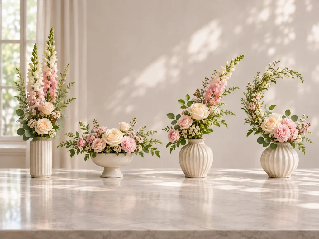
Design goal: A sculptural arrangement with a strong vertical direction and open space.
Suggested materials
- 2 or 3 tall calla lilies
- 1 naturally curved branch
- A few simple green leaves
- A narrow, sturdy vase
Begin with the branch.
Rotate it until its natural curve creates an interesting direction. The branch becomes the main line of the composition.
Add the calla lilies at different heights. Let one flower stand relatively upright while another turns slightly outward.
Position a few leaves near the lower part of the arrangement to connect the stems to the vase.
Avoid adding filler flowers just because the spaces look empty.
Here, the open areas are part of the design. They make the lines and individual flower forms easier to see.
Main elements: Line, form, and negative space.
Final check: Walk around the vase. Does the arrangement have a clear direction? Do the flowers support one another visually? Make sure the branch and long stems don’t cause the container to tip.
Example 3: A Loose Garden-Style Bouquet
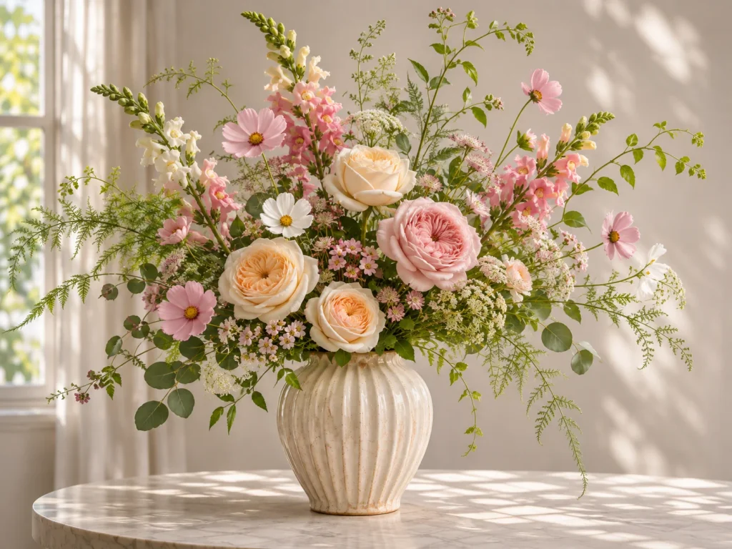
Design goal: A natural-looking arrangement with varied textures and a relaxed outline.
Suggested materials
- 3 garden roses
- 3 cosmos
- 2 snapdragons
- Small accent flowers
- Airy greenery
Start with the snapdragons and greenery to establish a loose shape.
Place the garden roses at different depths. Their fuller blooms will provide noticeable areas of color and form.
Add the cosmos around them, allowing a few stems to extend beyond the main outline.
Unlike the dining table centerpiece, this arrangement doesn’t need a carefully rounded silhouette.
Its character comes from flowing lines, contrasting textures, and differences in stem height.
Repeat one or two flower colors in different areas to connect the looser sections.
Main elements: Texture, line, pattern, and space.
Final check: Do the flowers look relaxed without appearing randomly placed? Can you see the larger roses clearly, or are they disappearing behind the greenery?
Each arrangement uses the same design elements, but the results are quite different. That’s why it helps to decide what you want the arrangement to look and feel like before choosing where every stem should go.
How to Apply the Elements of Floral Design Step by Step
This example creates a loose, slightly asymmetrical arrangement using common flowers. It introduces the elements in an order that makes the design easier to build.
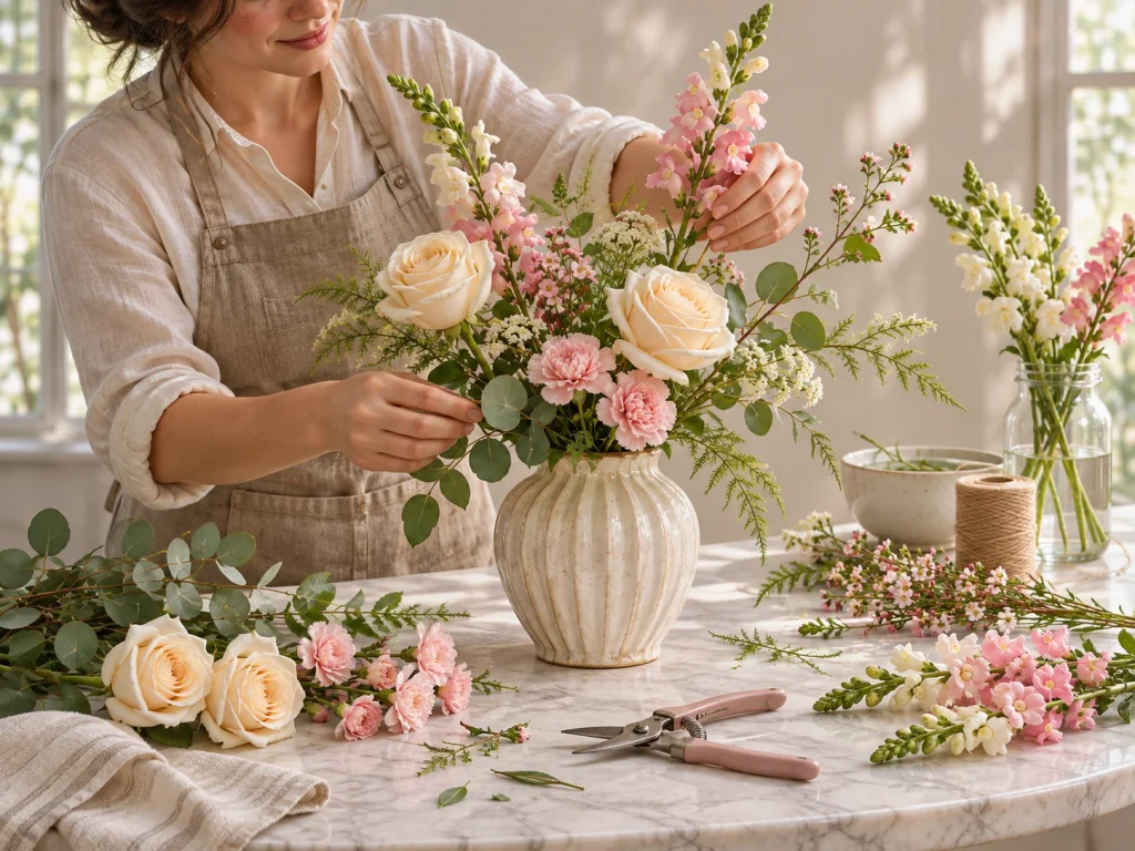
What You’ll Need
- 3 roses
- 2 snapdragons
- 3 spray carnations
- 4–5 leafy stems
- A few small accent flowers, if desired
- A clean, stable vase around 6–8 inches tall
- Clean floral snips
- Fresh water
Choose a vase with a neck that helps support the stems. If the opening is very wide, you may need additional stem support.
Step 1: Decide on the Overall Shape
Before cutting anything, place the flowers beside the vase.
For this arrangement, aim for a soft asymmetrical outline: slightly taller on one side, with the main flowers clustered loosely toward the center.
Identify the stems with the most interesting natural shapes.
Don’t trim them all to the same length. A curved stem may be more useful when left slightly longer.
Step 2: Establish the Main Lines
Fill the vase with clean water.
Remove any foliage that would sit below the waterline, then trim the snapdragon stems as needed.
Place the first snapdragon upright, slightly off-center. Position the second a little lower and angled outward.
Together, they establish the arrangement’s height and direction.
Add two or three leafy stems to begin outlining the lower part of the design.
At this stage, the vase may look unfinished. That’s expected.
Step 3: Position the Largest Flowers
Add the first rose near the central viewing area.
Position the second slightly lower and the third at a different depth.
Avoid placing all three flower heads in a straight horizontal line.
Look at the arrangement from the front and side. The roses should create noticeable shapes without completely hiding one another.
These are the flowers that will give the arrangement much of its visual weight.
Step 4: Build the Shape With Supporting Flowers
Add the spray carnations between the larger flowers.
Use their smaller blooms to connect separate areas, not to cover every visible opening.
If one carnation seems crowded, reposition it closer to the edge or lower in the vase.
You should begin to see the intended asymmetrical outline.
This is also a good moment to check whether the flower colors feel connected.
Step 5: Introduce Contrasting Textures
Add any remaining greenery and a few small accent flowers.
Look for places where a delicate texture would provide contrast with the rounded roses.
A slender stem near a large bloom may be more effective than several filler stems packed together.
Stop occasionally and check the arrangement from a distance. Extra material isn’t always an improvement.
Step 6: Refine the Spaces and Depth
Step back a few feet.
Look for flowers that overlap awkwardly, prominent blooms hidden behind foliage, and gaps that appear accidental.
Adjust one stem at a time.
You might pull a rose slightly forward, lower a carnation, or remove a piece of greenery that’s covering another flower.
These small changes often make a bigger difference than adding more flowers.
Step 7: Check the Finished Arrangement
Rotate the vase and examine it from the angles where people will see it.
Use this checklist before deciding you’re finished:
- The arrangement has a recognizable overall shape.
- The stems create a clear direction without appearing rigid.
- Large flowers are visible rather than buried.
- Flower heights and depths vary.
- Colors and textures feel connected.
- Open spaces appear intentional.
- The vase is stable and the stems are supported.
If the arrangement looks good from its intended viewing angles, it doesn’t need to be perfectly symmetrical.
Let the flowers keep some of their natural character.
Common Floral Design Mistakes and How to Fix Them
When a flower arrangement looks awkward, the problem is often more specific than simply needing additional flowers.
Use this table to identify what might be causing the issue.
| What Looks Wrong | Likely Cause | Practical Fix |
|---|---|---|
| Every flower appears at the same height | Too little variation in line and depth | Raise or lower selected stems |
| The bouquet looks crowded | Insufficient negative space | Remove or reposition a few stems |
| One side feels too heavy | Large or visually prominent flowers are concentrated together | Adjust flower placement to improve balance |
| The colors feel disconnected | No clear color relationship | Repeat a supporting color elsewhere |
| The arrangement looks flat | Flower heads occupy one plane | Move some blooms forward and others deeper |
| The design feels dull | Similar forms or textures dominate | Add contrast through flower shape or foliage |
| The vase overwhelms the flowers | Container and arrangement dimensions don’t work well together | Adjust the height, width, or container |
| The design looks unnaturally repetitive | Similar flowers are too evenly spaced | Vary the heights, spacing, or directions |
A Quick Way to Find the Problem
If you’re unsure what needs changing, take a photograph of the arrangement against a simple background.
Look at the photograph and ask three questions.
Where does my eye go first? If the intended main flowers disappear among the foliage, they may need a clearer position.
Can I see a recognizable shape? If the outline feels confused, adjust the longest or most prominent stems before moving smaller flowers.
Would removing something make it better? Temporarily take out one filler stem or supporting flower and compare the result.
Make one change at a time.
When you move several stems together, it’s difficult to tell which adjustment actually helped.
Elements vs. Principles of Floral Design: What’s the Difference?
The elements and principles of floral design are closely related, but they serve different purposes.
Elements describe the qualities available to the designer. Principles explain how those qualities are organized.
For example, color is an element. Using a strong color contrast to draw attention to one flower involves principles such as contrast and dominance.
Common floral design principles include:
| Principle | What It Means |
|---|---|
| Balance | Creating a sense of visual stability |
| Proportion | Establishing relationships between parts of the design |
| Scale | Considering how sizes relate to one another and the surrounding setting |
| Rhythm | Guiding the eye through the arrangement |
| Dominance | Making one feature or area more visually prominent |
| Contrast | Using differences to emphasize selected features |
Consider a vase containing one large burgundy dahlia and several smaller cream-colored flowers.
Their different sizes and colors are design elements.
Placing the dahlia where it becomes the main attraction demonstrates dominance. Distributing the smaller flowers to create a visually stable arrangement involves balance.
This distinction is useful when evaluating your own work.
If the flowers look beautiful individually but the arrangement feels awkward, you may need to change how the elements are organized rather than replace the materials.
A Simple Floral Design Exercise for Beginners
See how the same flowers can produce three different arrangements by changing their placement.
Gather three roses, three spray carnations, two tall flowers, a few leafy stems, and one vase. Take a photograph after each arrangement so you can compare the results.
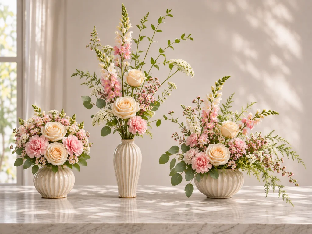
Arrangement A: Focus on Color and Form
Create a compact, rounded arrangement. Group the roses loosely near the center and position the carnations around them, varying their depth slightly.
Notice: How do the rounded outline and repeated colors make the flowers feel connected?
Arrangement B: Focus on Line and Space
Start again with the same flowers. Place the two tall stems at different angles and position the roses farther apart. Use fewer supporting stems to preserve open space.
Notice: How do the longer lines and visible gaps change the arrangement’s appearance?
Arrangement C: Focus on Texture and Pattern
Build a loose, asymmetrical arrangement. Mix the roses and carnations at different heights, add contrasting foliage, and repeat similar flowers in separate areas.
Notice: Which textures stand out, and how does repetition connect the composition?
Compare Your Results
Place the three photographs side by side.
Which arrangement has the clearest shape? Where does your eye go first? Which one would work best on a dining table or entryway console?
There’s no single correct result. The exercise shows how changing placement, spacing, and emphasis can transform an arrangement without changing the flowers.
Frequently Asked Questions About Floral Design Elements
What are the 7 basic elements of floral design?
The seven commonly taught elements are line, form, color, texture, space, size, and pattern. They describe the visual qualities that influence an arrangement’s appearance.
Understanding them helps you make better decisions about flower selection, placement, spacing, and overall shape.
Are there 7 or 8 elements of floral design?
Both frameworks are used in floral design education.
Iowa State University teaches seven elements: line, form, color, texture, space, size, and pattern.
National Garden Clubs uses an eight-element framework that includes light, while the American Institute of Floral Designers includes fragrance as its eighth element.
The difference comes from the educational framework being used, not from one universal list being incorrect.
What is the most important element of floral design?
No single element is the most important in every arrangement.
Color may define a bright mixed bouquet, while line and negative space may have a stronger influence on a minimalist composition.
The element that deserves the most attention depends on the design and the effect you want to achieve.
How can beginners use floral design elements together?
Start by choosing a clear shape and a small color palette.
Use a few stems to establish the main direction, position larger flowers at different depths, and add supporting flowers without filling every opening.
Step back regularly to check the arrangement’s shape, spacing, and visual balance.
Final Thoughts
Learning the elements of floral design changes how you look at flowers. Instead of adding stems until a vase looks full, you begin noticing direction, form, color relationships, texture, and the spaces between blooms.
Start with a few flowers, experiment with their placement, and observe what happens when you change the height, spacing, or direction of a stem.
Over time, you’ll get better at recognizing what an arrangement needs—and just as importantly, when it doesn’t need anything else.
1 thought on “Elements of Floral Design: 7 Essentials With Practical Examples”
Comments are closed.